# Text Input & Textarea
URL: /components/text-input
Source: https://github.com/daangn/seed-design/blob/dev/docs/content/components/text-input.mdx
사용자로부터 텍스트를 입력받는 컴포넌트입니다.
| Platform | Status | Note |
| --- | --- | --- |
| Figma | Done | |
| [React](/react/components/text-field-input) | Done | |
| [Lynx](/lynx/components/text-field-input) | Done | Textarea는 /lynx/components/text-field-textarea 문서를 참고하세요. |
| iOS | Done | |
| Android | Done | |
## Text Input
한 줄 텍스트를 입력받는 컴포넌트입니다.
Text Input을 Field 내부에서 사용하여 Text Field로 활용할 수 있습니다.
### Anatomy
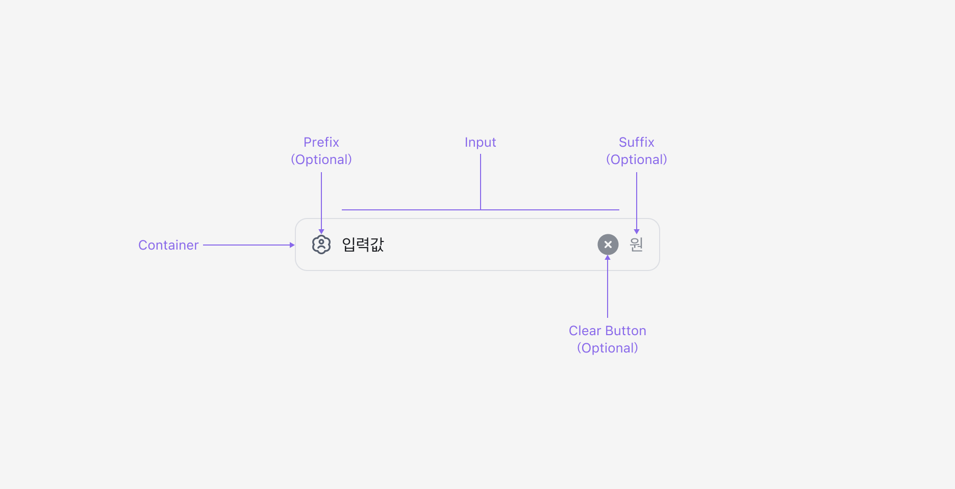
Text Input은 입력 필드, 이를 감싸는 Container, Clear Button (Optional), 그리고 Prefix/Suffix Slot으로 구성됩니다.
### Properties
#### State
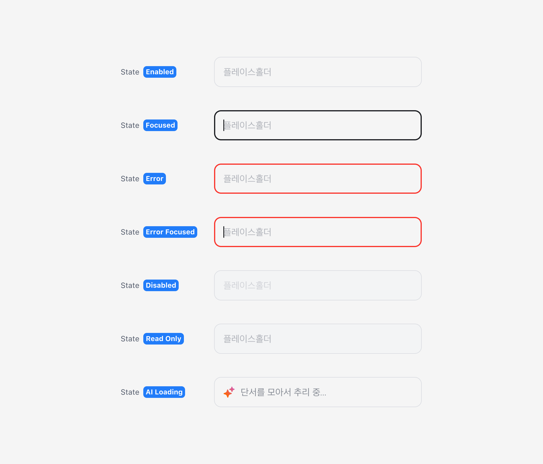
Text Input은 Enabled, Focused, Error, Error Focused, Disabled, Read Only, AI Loading (Figma Only) 상태를 가집니다.
#### Has Value Property
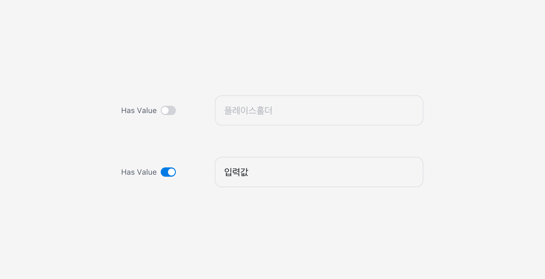
Text Input에 값이 있는 경우 Has Value Property를 사용할 수 있습니다.
#### Clear Button Property
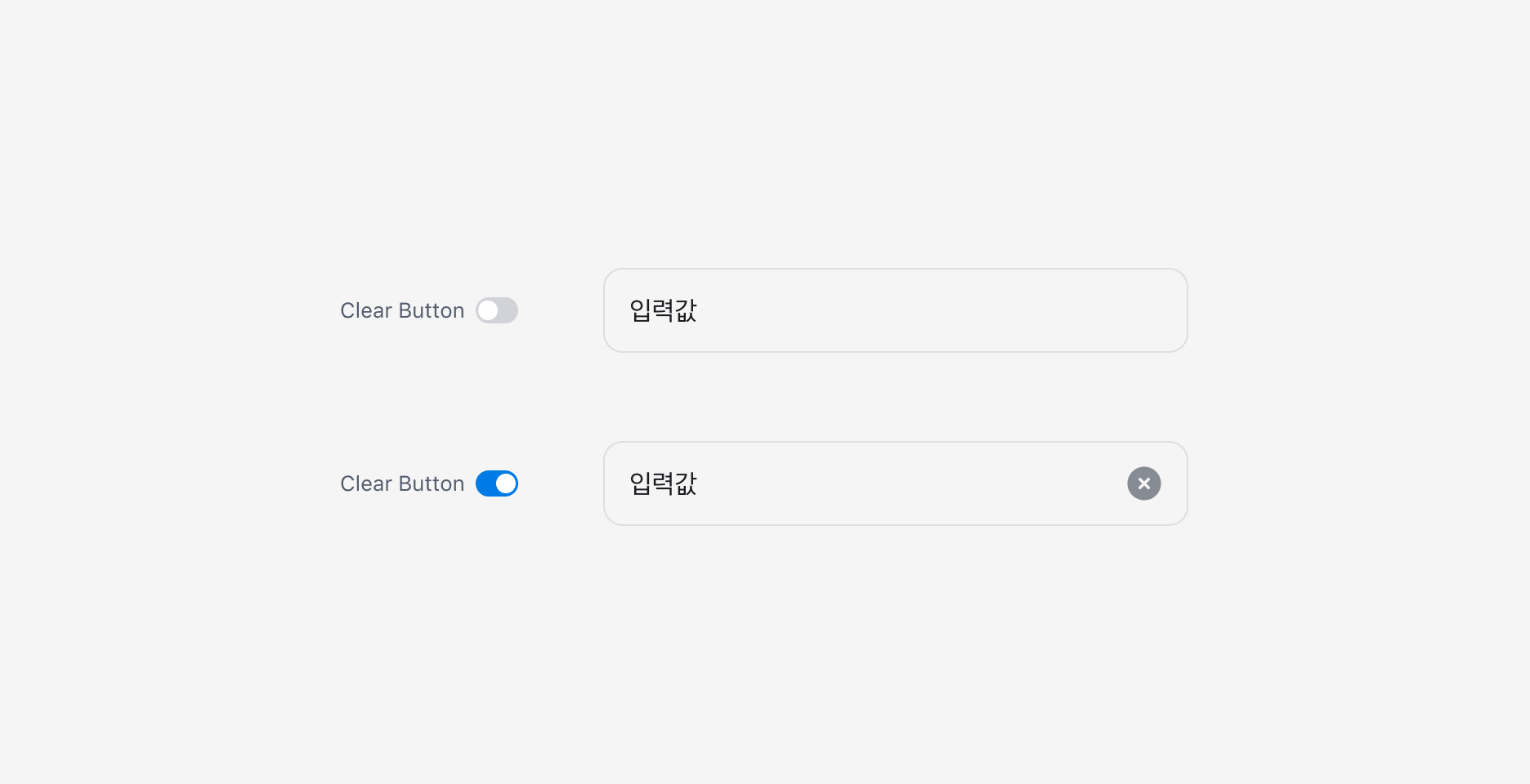
Text Input에 값이 존재하는 경우, 해당 값을 한 번에 삭제할 수 있는 Clear Button을 표시할 수 있습니다.
#### Variant
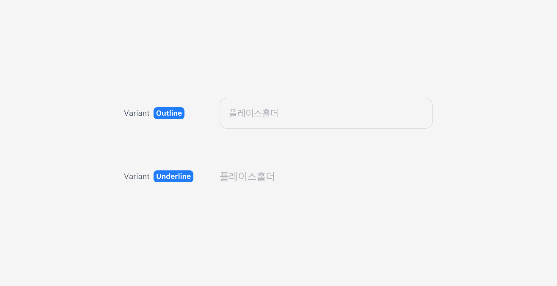
Text Input은 Outline과 Underline 두 가지 스타일을 제공합니다.
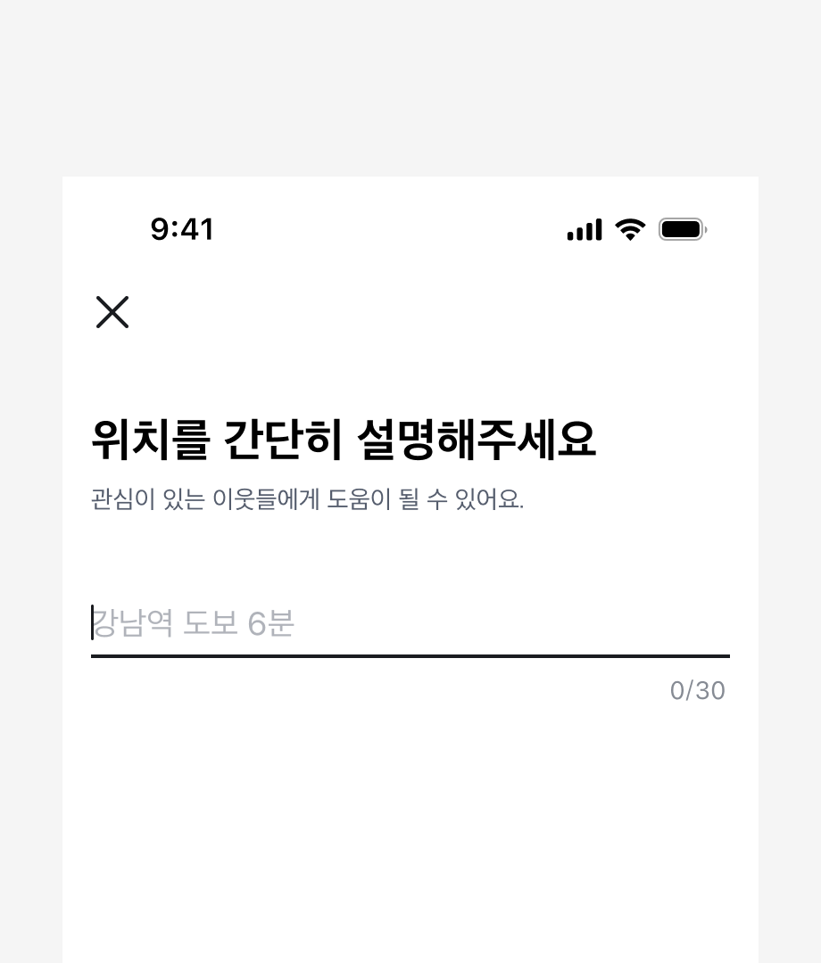
화면에 하나의 Input만 있는 경우 Underline 사용을 권장합니다.
### Custom Input
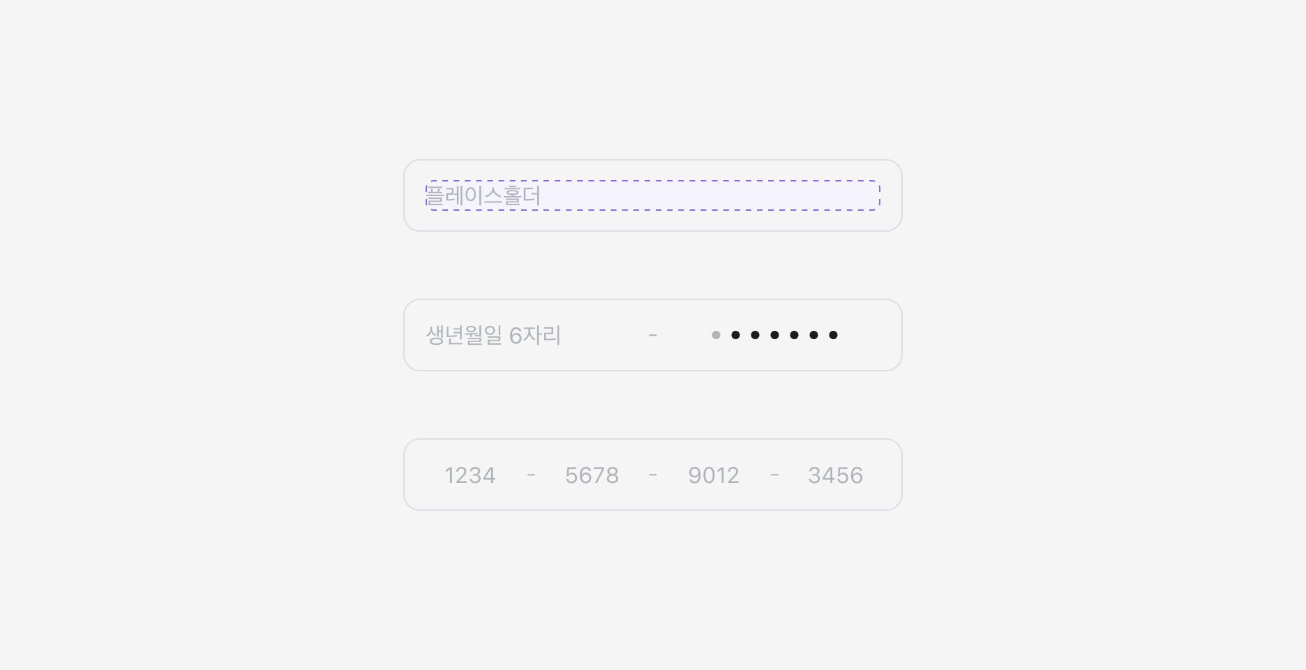
Text Input의 입력 영역은 Slot으로 구성되어 있습니다.
특수한 포맷이나 마스킹 등의 기능이 필요한 경우, 포맷과 동작을 직접 정의해서 사용할 수 있습니다.
### Text Input을 2열로 구성하기
한 화면에서 입력할 내용이 많을 경우, Input을 2열 레이아웃으로 구성할 수 있습니다.
{/*
*/}
레이블과 입력값이 짧을 때만 사용하는 것을 권장하며, 레이아웃 사이 간격을 충분히 확보하여 사용자가 실수로 옆 Input을 선택하지 않도록 주의해주세요.
주민등록번호나 전화번호처럼 입력 형식이 정해진 경우, Input을 나누지 말고 값에 포맷을 자동으로 적용해서 추가 인터랙션 없이 한 번에 입력할 수 있도록 해주세요.
***
## Textarea
여러 줄의 텍스트를 입력받을 수 있는 컴포넌트로, 자동 리사이즈를 지원합니다.
Textarea를 Field 내부에서 사용하여 Textarea Field로 활용할 수 있습니다.
### Anatomy
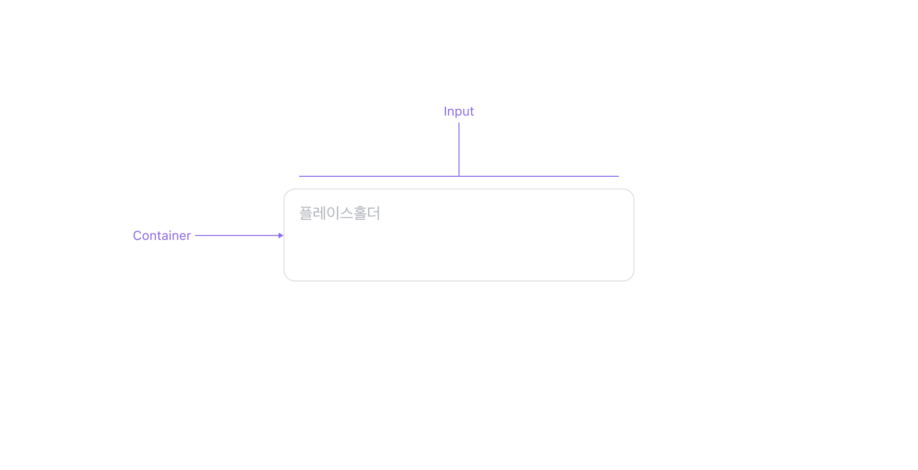
Textarea는 입력 필드, 이를 감싸는 Container로 구성됩니다.
### Properties
#### State
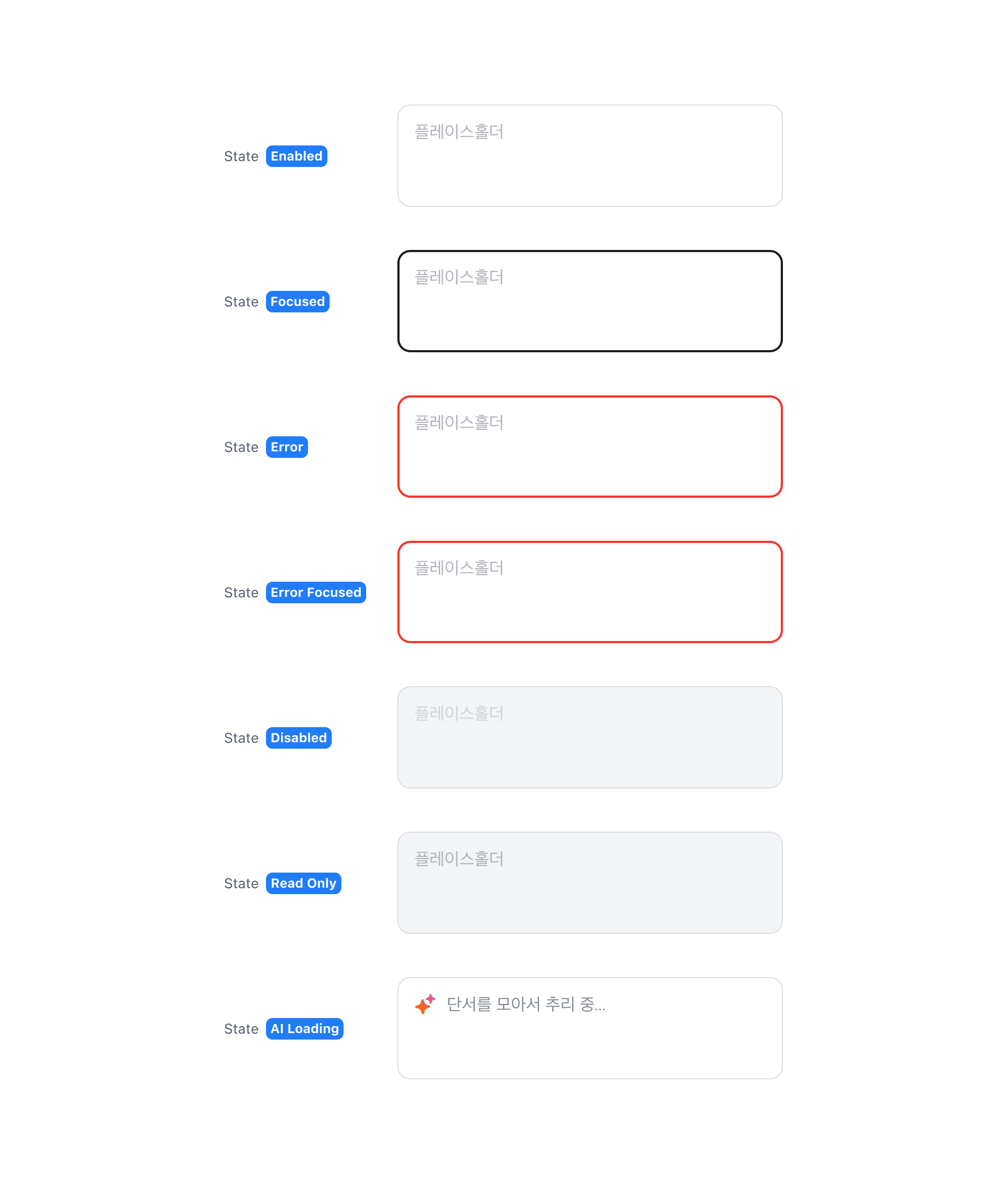
Textarea는 Enabled, Focused, Error, Error Focused, Disabled, Read Only, AI Loading (Figma Only) 상태를 가집니다.
#### Has Value Property
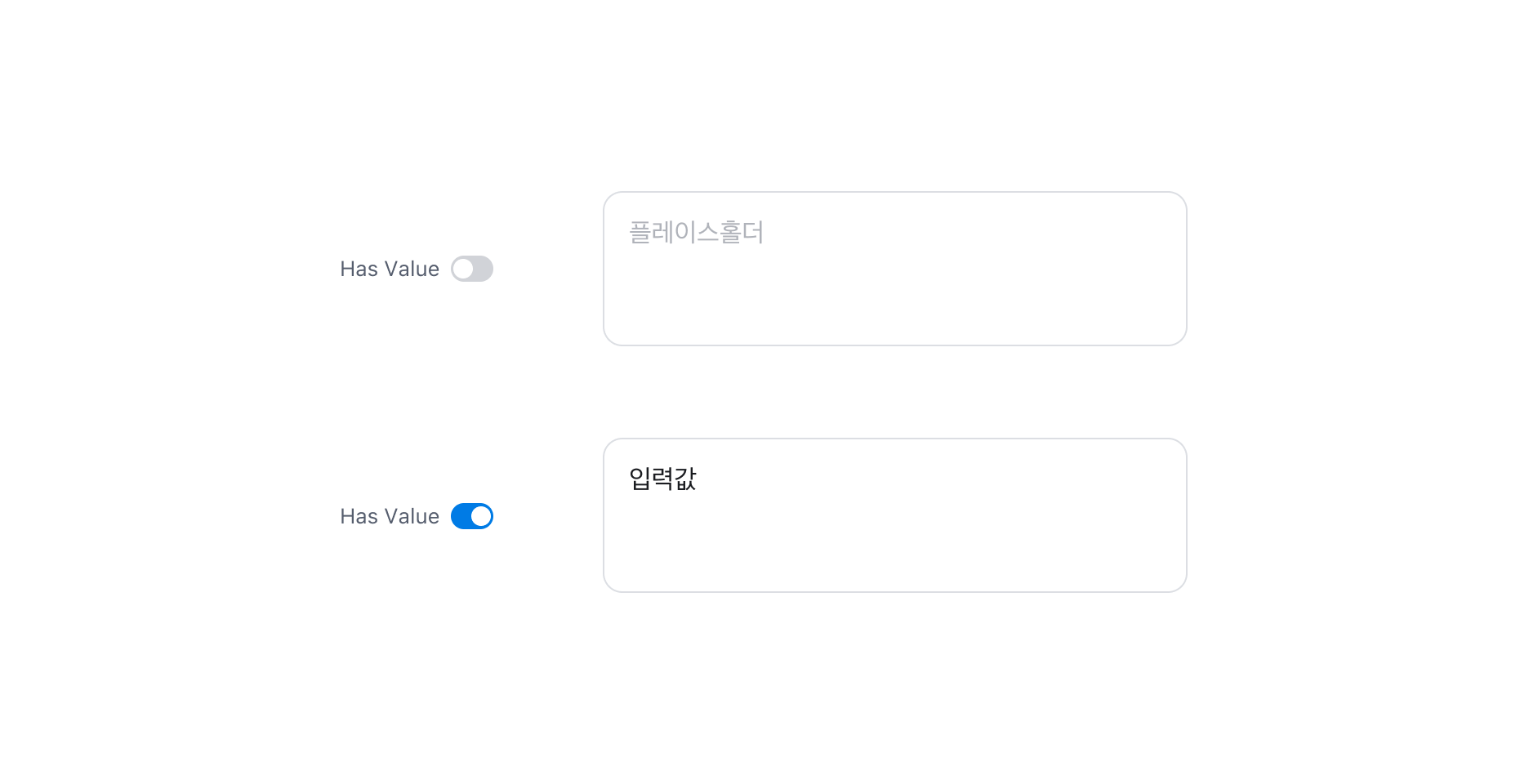
Textarea에 값이 있는 경우 Has Value Property를 사용할 수 있습니다.
#### Auto Size
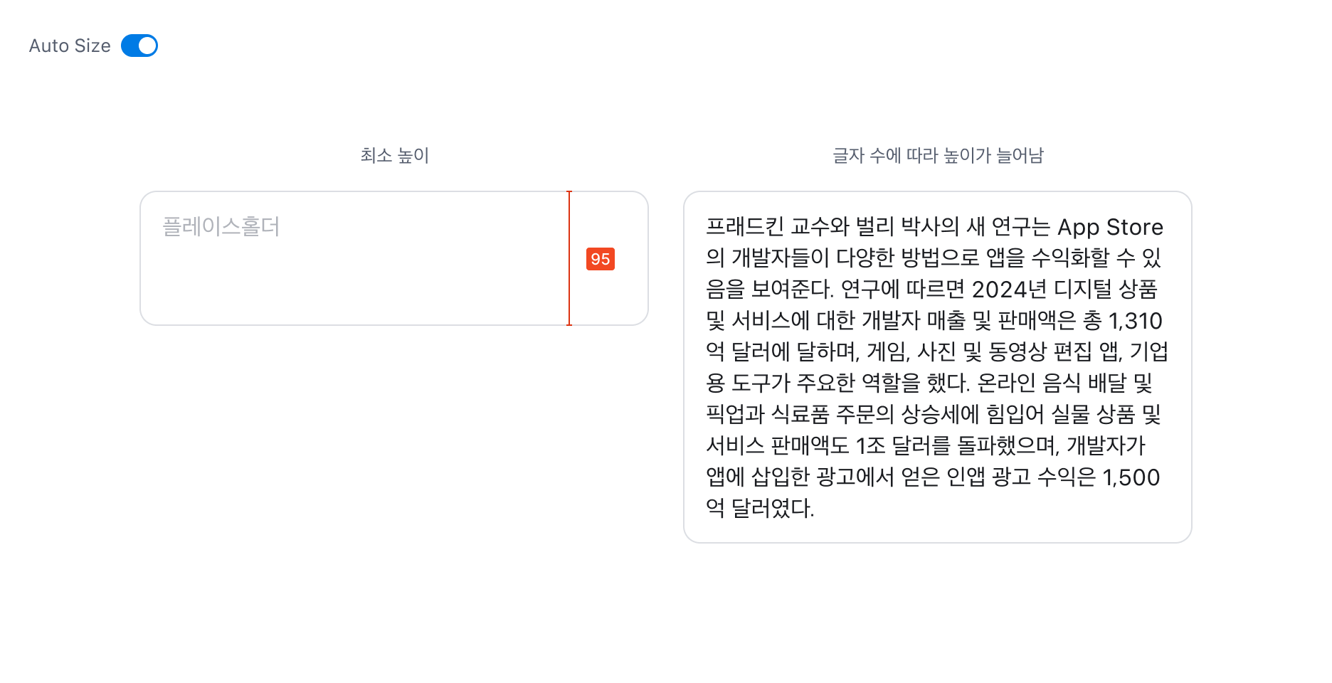
Auto Size 옵션을 사용하면 입력된 글자 수에 따라 Textarea의 높이가 자동으로 늘어납니다. 이 경우 Textarea의 최소 높이는 3줄(95px)을 유지해야 합니다. 최대 높이는 기본적으로 제한이 없으며, 필요에 따라 최대 높이를 별도로 지정할 수 있습니다.
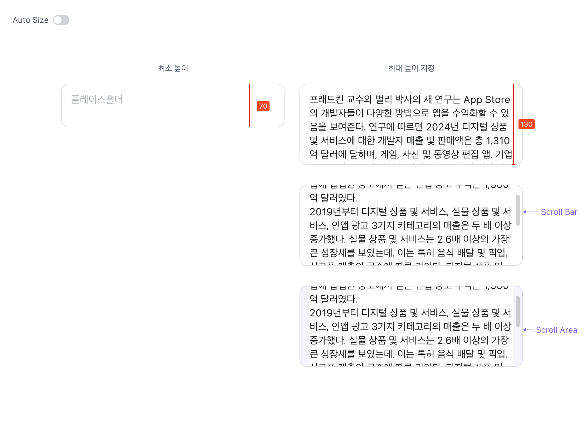
Auto Size를 비활성화할 경우, 최소 높이는 2줄(70px)이어야 합니다. 이때는 반드시 최대 높이 값을 지정해야 하며, 내용이 최대 높이를 초과하면 Input 영역 내에서 스크롤이 생성됩니다.
## Specification
Component spec (JSON): /rootage/components/text-input.json