# App Screen
URL: /react/stackflow/app-screen
Source: https://github.com/daangn/seed-design/blob/dev/docs/content/react/stackflow/app-screen.mdx
Stackflow 네비게이션에서 개별 화면을 구성하는 컴포넌트입니다. 모바일 앱과 같은 화면 전환 경험을 제공할 때 사용됩니다.
사용 가능 버전: @seed-design/stackflow@0.0.1, @seed-design/css@0.0.1
```tsx
import { IconBellFill } from "@karrotmarket/react-monochrome-icon";
import { Flex } from "@seed-design/react";
import type { StaticActivityComponentType } from "@stackflow/react/future";
import {
AppBar,
AppBarCloseButton,
AppBarIconButton,
AppBarLeft,
AppBarMain,
AppBarRight,
} from "seed-design/ui/app-bar";
import { AppScreen, AppScreenContent } from "seed-design/ui/app-screen";
declare module "@stackflow/config" {
interface Register {
ActivityAppScreenPreview: {};
}
}
const ActivityAppScreenPreview: StaticActivityComponentType<"ActivityAppScreenPreview"> = () => {
return (
Preview
Preview
);
};
export default ActivityAppScreenPreview;
```
## Installation
- npm: npx @seed-design/cli@latest add ui:app-screen
- pnpm: pnpm dlx @seed-design/cli@latest add ui:app-screen
- yarn: yarn dlx @seed-design/cli@latest add ui:app-screen
- bun: bun x @seed-design/cli@latest add ui:app-screen
## Usage
```tsx
import {
AppBar,
AppBarBackButton,
AppBarCloseButton,
AppBarIconButton,
AppBarLeft,
AppBarMain,
AppBarRight,
} from "seed-design/ui/app-bar";
import { AppScreen, AppScreenContent } from "seed-design/ui/app-screen";
```
```tsx
Title
{/* actions */}
{/* content */}
```
## Props
### App Screen
#### `AppScreen`
#### `AppScreenContent`
### App Bar
#### `AppBar`
#### `AppBarLeft`
#### `AppBarMain`
#### `AppBarRight`
#### `AppBarIconButton`, `AppBarBackButton`, `AppBarCloseButton`
## Examples
### Tones
AppScreen의 `tone` 속성을 `transparent`로 설정하여 투명한 배경을 사용할 수 있습니다.
- `AppBar`의 배경이 투명해집니다.
- 모바일 OS 상태바를 포함한 `AppScreen` 상단에 그라디언트가 표시됩니다.
- `gradient` 속성을 `false`로 설정하여 숨길 수 있습니다.
```tsx
import { IconBellFill } from "@karrotmarket/react-monochrome-icon";
import { Flex } from "@seed-design/react";
import type { StaticActivityComponentType } from "@stackflow/react/future";
import {
AppBar,
AppBarCloseButton,
AppBarIconButton,
AppBarLeft,
AppBarMain,
AppBarRight,
} from "seed-design/ui/app-bar";
import { AppScreen, AppScreenContent } from "seed-design/ui/app-screen";
declare module "@stackflow/config" {
interface Register {
ActivityAppScreenTransparent: {};
}
}
const ActivityAppScreenTransparent: StaticActivityComponentType<
"ActivityAppScreenTransparent"
> = () => {
return (
Preview
Preview
);
};
export default ActivityAppScreenTransparent;
```
#### With Intersection Observer
Intersection Observer를 사용해 `AppBar`의 `tone` 속성을 동적으로 변경할 수 있습니다.
```tsx
import { IconBellFill } from "@karrotmarket/react-monochrome-icon";
import { Flex } from "@seed-design/react";
import type { StaticActivityComponentType } from "@stackflow/react/future";
import { useEffect, useRef, useState } from "react";
import {
AppBar,
AppBarCloseButton,
AppBarIconButton,
AppBarLeft,
AppBarMain,
type AppBarProps,
AppBarRight,
} from "seed-design/ui/app-bar";
import { AppScreen, AppScreenContent } from "seed-design/ui/app-screen";
declare module "@stackflow/config" {
interface Register {
ActivityAppScreenIntersectionObserver: {};
}
}
const ActivityAppScreenIntersectionObserver: StaticActivityComponentType<
"ActivityAppScreenIntersectionObserver"
> = () => {
const [tone, setTone] = useState("transparent");
const whiteImageRef = useRef(null);
useEffect(() => {
const observer = new IntersectionObserver(
(entries) => {
const entry = entries[0];
if (!entry.isIntersecting) {
// 이미지 영역을 벗어나면 tone을 layer로 변경
setTone("layer");
} else {
// 이미지 영역을 포함하면 tone을 transparent로 변경
setTone("transparent");
}
},
{
threshold: [0, 0.1, 0.5, 1],
rootMargin: "0px",
},
);
if (whiteImageRef.current) {
observer.observe(whiteImageRef.current);
}
return () => {
observer.disconnect();
};
}, []);
return (
Preview
하얀 이미지
컨텐츠 영역
);
};
export default ActivityAppScreenIntersectionObserver;
```
### Layer Offset Top
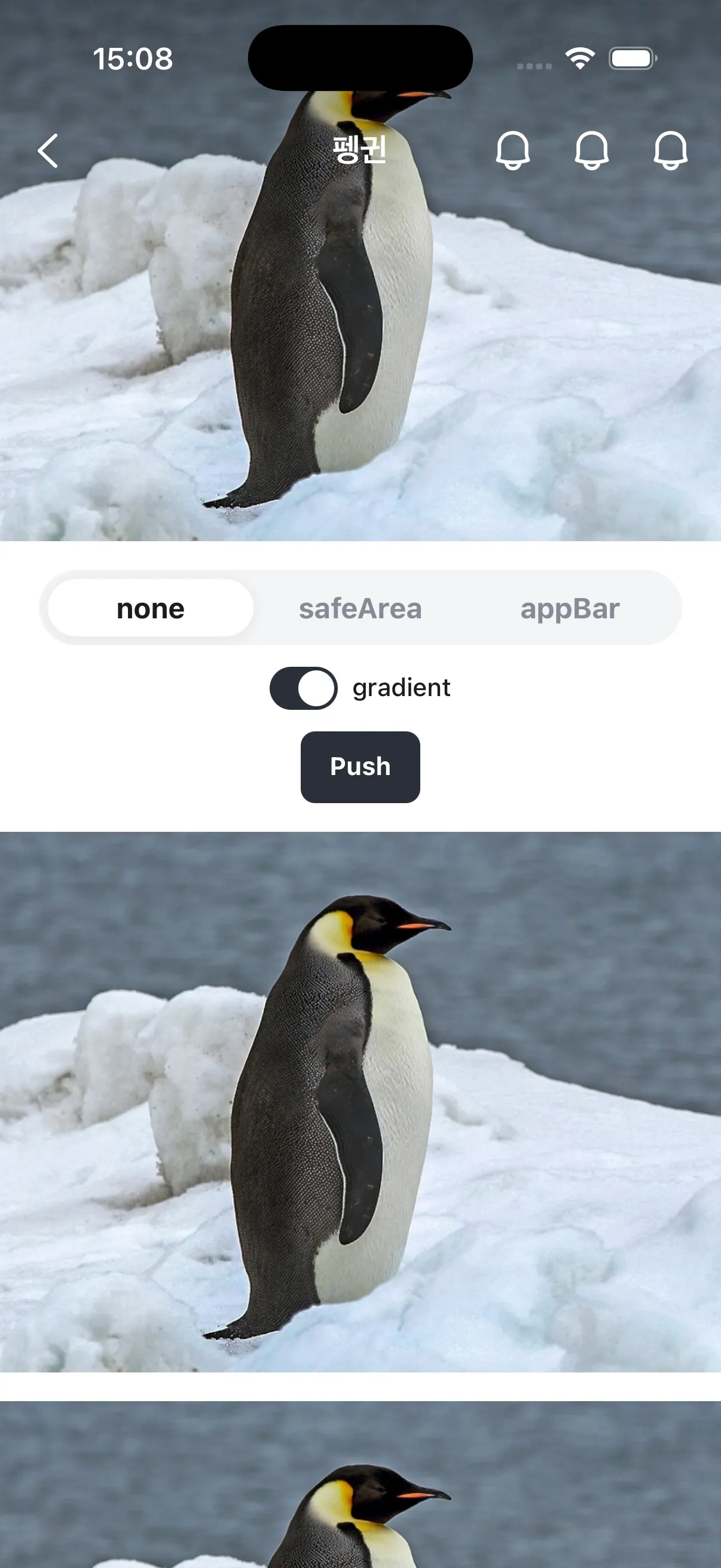
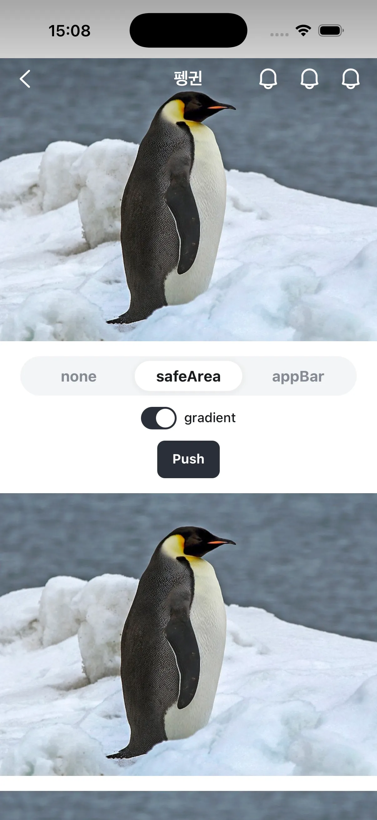
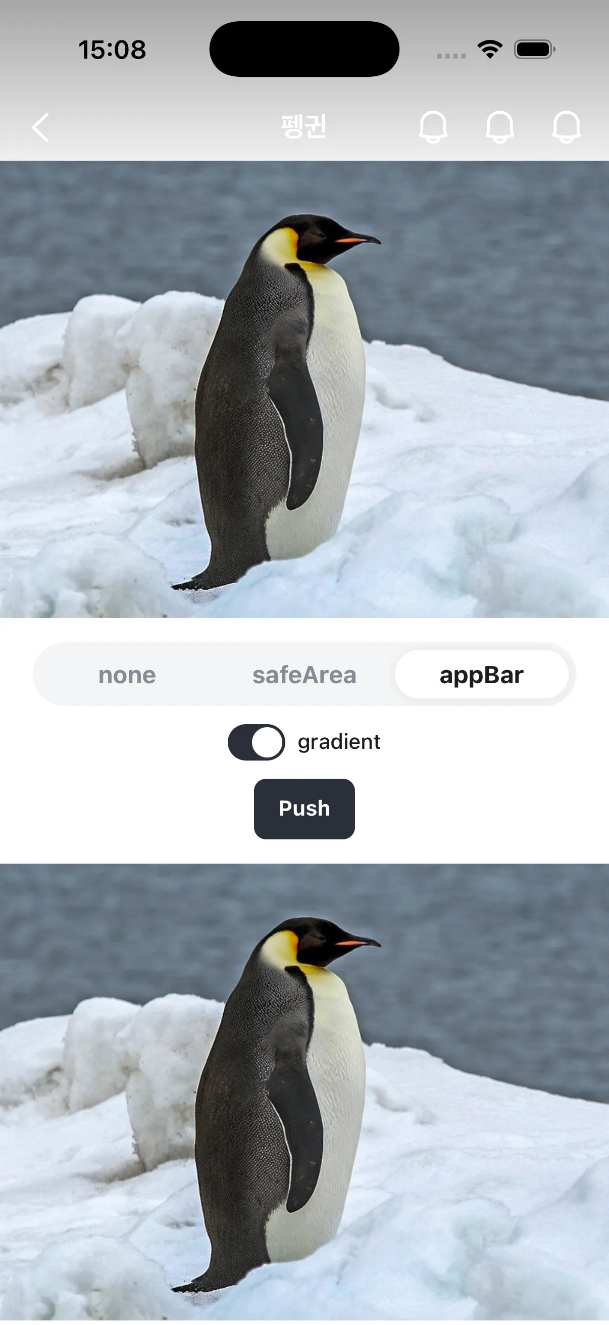
`layerOffsetTop` 속성을 사용해 `AppScreenContent`의 상단 오프셋을 조정할 수 있습니다.
`tone="transparent"`와 `gradient`를 사용하는 경우, 일반적으로 `layerOffsetTop="none"`을 함께 설정하여 모바일 OS 상태바 영역까지 콘텐츠 영역을 확장합니다.
디스플레이 컷아웃 (notch) 등 safe area를 올바르게 처리하기 위해 `viewport-fit=cover`가 포함된 `viewport` 메타 태그를 사용하세요.
```html
```
### Customizing App Bar
`tone="layer"`인 경우 `AppBar`의 색상을 변경할 수 있습니다.
`AppBarIconButton` 내에 `Icon` 컴포넌트를 사용하여 아이콘을 커스터마이징할 수 있습니다.
아이콘 컴포넌트에 대해 자세히 알아봅니다.
```tsx
import { Flex, Icon } from "@seed-design/react";
import { IconBellFill } from "@karrotmarket/react-monochrome-icon";
import type { StaticActivityComponentType } from "@stackflow/react/future";
import { AppBar, AppBarIconButton, AppBarMain, AppBarRight } from "seed-design/ui/app-bar";
import { AppScreen, AppScreenContent } from "seed-design/ui/app-screen";
declare module "@stackflow/config" {
interface Register {
ActivityAppScreenAppBarCustomization: {};
}
}
const ActivityAppScreenAppBarCustomization: StaticActivityComponentType<
"ActivityAppScreenAppBarCustomization"
> = () => {
return (
} color="palette.blue500" size="x5" />
Preview
);
};
export default ActivityAppScreenAppBarCustomization;
```
#### Custom Elements in App Bar
`AppBar` 내에 `AppBarLeft`, `AppBarMain`, `AppBarRight`에 대응되지 않는 커스텀 요소를 배치하는 경우, 다른 요소와 동일한 화면 전환 트랜지션을 적용하기 위해 `AppBarSlot` 컴포넌트를 사용합니다.
`AppBarSlot`은 하위 요소에 `class`를 주입하여 트랜지션을 적용하며, 추가 마크업은 생성하지 않습니다.
```tsx title='ActivityAppBarSlot.tsx'
import { useActivity, useFlow, type StaticActivityComponentType } from "@stackflow/react/future";
import {
AppBar,
AppBarBackButton,
AppBarLeft,
AppBarRight,
AppBarIconButton,
AppBarSlot,
} from "seed-design/ui/app-bar";
import { AppScreen, AppScreenContent } from "seed-design/ui/app-screen";
import { IconBellLine } from "@karrotmarket/react-monochrome-icon";
import { Flex, Text, VStack } from "@seed-design/react";
import { ActionButton } from "seed-design/ui/action-button";
declare module "@stackflow/config" {
interface Register {
ActivityAppBarSlot: Record;
}
}
function FakeSearchBar(props: React.HTMLAttributes) {
return (
검색어를 입력하세요
);
}
const ActivityAppBarSlot: StaticActivityComponentType<"ActivityAppBarSlot"> = () => {
const { isRoot } = useActivity();
const { push } = useFlow();
return (
{!isRoot && (
)}
AppBar.Slot은 커스텀 요소에 stackflow 트랜지션 애니메이션을 적용합니다. 이 페이지에서
뒤로 swipe하면 검색바가 IconButton과 동일하게 fade 트랜지션됩니다.
push("ActivityAppBarSlot", {})} variant="neutralSolid">
이 액티비티 다시 열기
);
};
export default ActivityAppBarSlot;
```
### Preventing Swipe Back
`preventSwipeBack` 속성을 사용해 `theme="cupertino"`인 AppScreen에서 edge 영역을 렌더링하지 않음으로써 스와이프 백 제스처를 방지할 수 있습니다.
### Transition Styles
`transitionStyle` 속성을 사용해 AppScreen이 최상위로 push되거나 최상위에서 pop될 때 재생할 트랜지션을 지정할 수 있습니다.
최상위: `useActivity().isTop === true`인 액티비티로 만들어진 AppScreen을
의미합니다.
별도로 지정하지 않는 경우, `transitionStyle`은 `theme`에 따른 기본값을 갖습니다.
- `theme="cupertino"`: `slideFromRightIOS`
- `theme="android"`: `fadeFromBottomAndroid`
최상위 AppScreen이 push/pop될 때, 최상위가 아닌 AppScreen도 함께 트랜지션을 재생합니다.
**`@seed-design/stackflow@1.1.15`까지**
최상위 AppScreen이 push/pop될 때, 최상위가 아닌 AppScreen은 각 AppScreen의 고유한 `transitionStyle`을 재생합니다.
- 예를 들면, `transitionStyle="fadeFromBottomAndroid"`인 0번 AppScreen 위에 `transitionStyle="slideFromLeftIOS"`인 1번 AppScreen이 push되는 경우, 0번 AppScreen은 `fadeFromBottomAndroid` 트랜지션을 재생합니다.
- 0번 AppScreen이 위치 변화 없이 그대로 유지된 상태에서(`fadeFromBottomAndroid`) 1번 AppScreen이 우측에서 슬라이드 인(`slideFromLeftIOS`)
**이후 버전**
최상위 AppScreen이 push/pop될 때, 최상위가 아닌 AppScreen은 최상위 AppScreen의 `transitionStyle`을 재생합니다.
- 같은 스택 내에 여러 `transitionStyle`이 공존할 때 자연스러운 트랜지션을 제공합니다.
- 예를 들면, `transitionStyle="fadeFromBottomAndroid"`인 0번 AppScreen 위에 `transitionStyle="slideFromLeftIOS"`인 1번 AppScreen이 push되는 경우, 0번 AppScreen은 `slideFromLeftIOS` 트랜지션을 재생합니다.
- 0번 AppScreen이 자연스럽게 좌측으로 조금 밀려나며 어두워지고(`slideFromLeftIOS`) 1번 AppScreen이 우측에서 슬라이드 인(`slideFromLeftIOS`)
```tsx title='ActivityTransitionStyle.tsx'
import { VStack, Text } from "@seed-design/react";
import { useFlow, type StaticActivityComponentType } from "@stackflow/react/future";
import {
AppBar,
AppBarBackButton,
AppBarIconButton,
AppBarLeft,
AppBarMain,
AppBarRight,
} from "seed-design/ui/app-bar";
import { AppScreen, AppScreenContent, type AppScreenProps } from "seed-design/ui/app-screen";
import { IconHouseLine } from "@karrotmarket/react-monochrome-icon";
import { ActionButton } from "seed-design/ui/action-button";
import { appScreenVariantMap } from "@seed-design/css/recipes/app-screen";
import { Snackbar, useSnackbarAdapter } from "seed-design/ui/snackbar";
import { SegmentedControl, SegmentedControlItem } from "seed-design/ui/segmented-control";
import { useState } from "react";
declare module "@stackflow/config" {
interface Register {
ActivityTransitionStyle: {
transitionStyle: NonNullable;
};
}
}
const ActivityTransitionStyle: StaticActivityComponentType<"ActivityTransitionStyle"> = ({
params: { transitionStyle },
}) => {
const { push } = useFlow();
const { create } = useSnackbarAdapter();
const [preventSwipeBack, setPreventSwipeBack] = useState(false);
return (
{
create({ render: () => , timeout: 500 });
}}
onSwipeBackEnd={({ swiped }) => {
create({ render: () => , timeout: 500 });
}}
>
{/* can be undefined if search parameter isn't provided */}
push("ActivityHome", {})}>
{appScreenVariantMap.transitionStyle.map((style) => (
push("ActivityTransitionStyle", { transitionStyle: style })}
>
{style}
))}
Prevent Swipe Back
setPreventSwipeBack(value === "true")}
aria-label="Prevent Swipe Back"
>
false
true
);
};
export default ActivityTransitionStyle;
```